This weekend I caucused like crazy. I was really surprised by the Obama momentum and I feel, now, as though I was a part of something special. But at the time, I sort of made a fool of myself (as usual). In figuring out how to divvy up our delegates we had to talk about why we supported our candidate. I was the last to speak and, by then, everybody had, for the most part, dissected each candidate. But I spoke as passionately as possible. When I had finished there was silence and everyone was looking at me as though I had a miniature kangaroo dancing on my head. Needless to say, I am surprised that they didn't discount my vote altogether. I wish I had Lawrence Lessig's argument with me. Take a look...
Leave it to a French person to put the final nail in the coffin of Postmodern irony. Michel Gondry is a very innovative film director (Eternal Sunshine of the Spotless Mind, The Science of Sleep) who often has his characters enter magical mental spaces that are filled with fantastic but low budget-like imagery. This imagery is a subtle (and sometimes not so subtle) comment on filmmaking itself and the glossy imagery of Hollywood in particular. It is a complex dialog that ultimately reaffirms the connections between the cinematic image and the mental representation. What is fun and new is Gondry's pseudo-DIY aesthetic.
It makes sense, then, that Gondry is the director for the film "Be Kind, Rewind" starring Jack Black as a magnetized friend of Mos Def, a video store clerk. The two have to recreate the films Jack has accidentally erased. Here is the trailer for the film (pay attention closely):
Ok, here's where Gondry pulls a po-mo twist: he has created his own trailer for the film in the same manner of the characters in the film. This is 3rd order simulacra when you consider he is referencing work in the trailer that was referencing the original film. What we are left with is a crazy, barely referential pastiche of symbols that is, for the most part, impossible to make sense of:
Originally uploaded by seanbonner.
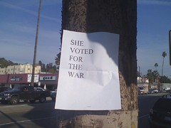
I find this fascinating because it says a lot in a very simple way. There is an assumption here, however, on the part of the creator that we'd know who "she" is. Not to analyze this to death but the fact that it has done the rounds online tells me that another assumption was that it would have a larger audience and that it would essentially be preaching to the choir. Regardless the simple both in form and content make it a sharp, direct piece.

My illustration of Eustace Tilley, the iconic dandy from The New Yorker magazine, found its way onto the great urban travel blog Gridskipper today.
UPDATE: My Eustace was selected by The New Yorker. See it here.
An audio commentary about Eustace Tilley and the contest that mentions my entry is available here.
Two Rivers is a documentary film about reconciliation efforts by European Americans and Native Peoples in Twisp, Washington. I was attracted to the story not only because it was local but also I was interested in seeing the outcome. It didn't disappoint. View the trailer and, if possible, find and see the film.
Another project about the meeting of cultures and the importance of hearing stories about the lives of others is White City Stories. The films on the site tell about life in the hills of Southern Peru. It is a fascinating journey.
Both projects are worth your attention.
Found the video below while looking for the Two Rivers film site. Beautiful.

Illustration Friday: Horizon
I finished reading Cormac McCarthy's The Road a while back and it has haunted me since. I tried, with this image, to capture the darkness and the gray landscape that makes the story so vivid yet suffocating.
This video is a powerful statement about race and class in Britain.
For succinct and comprehensive analysis read this posting from Obtusity.
For succinct and comprehensive analysis read this posting from Obtusity.
I can't really file this under Design in a Small Town because I am sure it is happening everywhere.
My local Safeway, which seemingly just opened in its present location a few years ago, has undergone some renovation. The whole notion of renovation to a store that was new to begin with is utterly confounding to me.
The newspapers (yes, apparently this merits coverage) report that Safeway is now better suited to be a 'lifestyle' store. I have searched for some meaning in that and I have to call a designer/marketing bluff and say this is nonsense. I am sure I will royally anger other designers by this proclamation but the fact is this is appears to be a frivolous venture meant simply to provide Safeway with some differentiation when, inevitably, the Walmart superstore goes in across the street. Safeway = equals lifestyle (read 'high class') and Walmart = equals convenience and economy (read 'low class'). The brilliant part of this is that by claiming the lifestyle status, Safeway gives itself justification for its prices. Heck, they might even want to set the prices higher for allowing us to experience their store.
It is funny how 'lifestyle' is expressed. It is as though the Starbucks, once relegated to an awkward corner of the store, has now exploded, covering the rest of the store in a creamy hazel nut mocha wash. But this doesn't produce lifestyle. I still buy the same crap that I did before. I am not viewing myself any differently when I shop there. It is still the same old Safeway just darker, I suppose.
The store is dark. Apparently, my lifestyle is supposed to be vision impaired. Dim lights, faux cherry fixtures. In fact, it is so dark my wife and I joked that the next time we visit they are going to have to hand out flashlights. The fixtures are interesting, actually, because the cherry wood makes the bread aisle as though it were some sort of library reading room.
In fact, the whole store has that feel. It is an exclusive men's club. Ironically, when the store takes this affectation, the in-store Starbucks still seems awkward. It has grown in the current redesign and now, strangely, includes a fireplace. I am not sure anymore how exactly I am to use the store. Do I hang out by the fireplace with my skinny half-caff latte then, when the grocery mood hits me, wander the store in search of items meant to supplement my social standing? Or do I buy my crap but then, to reaffirm that I am more elevated that my Tide and Bounty suggest, I can put my feet up by the fire and count my commercial blessings?
I guess one good thing about the dim lights could be that the store looks cleaner than it really is. You know the Walmart will be bright enough to reveal the everyday, working class grime.
But beyond the differentiation one should consider the strangeness of this arrangement. Our grocery spaces, it seems now have to be injected with mood and atmosphere. Yet, our public structures (libraries in particular) which should have that same sort of quietness and interiority are all about transit, openness, and light. The university libraries, for instance, are about windows and wide, communal spaces.
Needless to say, we can see that our focus is to be trained in the commercial site and the public place is quite the opposite. Public spaces, for the most part, represent prestige and scale yet are designed to move you through. Not to linger and contemplate but to move on to other spaces.
Perhaps to the comfort of a lifestyle space.
Read this and feel concerned, please.
Graphic Novels are often remarkable for the frankness in which they deal with issues that, until recently, were not the common fare in comic form. In fact the strength of the graphic novel, as opposed to the traditional comic serial, is a concentrated storytelling that allows for in-depth exploration of ideas, relationships, and more implicit internal states. The complexity of stories then is allowed to occur in ways often developed through a series of parallel sub-stories or shifts in time that rival anything found in, say, HBO dramas or the well-crafted film.
If graphic novels are a sort of visually-rich literary meat (Chris Ware's Jimmy Corrigan being a very juicy prime cut), then comic strips are the equivalent of those little baco-bits that your grandma used to sprinkle on your salad to hide the fact that lettuce had gone a little limp.
Recently, two baco-bit comic strips from my youth have become, I dunno, hormone injected (my metaphor is falling apart) and thus more meaty. For Better or For Worse, while at times super-saccharin, has also had moments of emotional intensity and social consciousness. I remember several years ago a storyline that followed a gay character. I found the telling the of his story remarkable in its unremarkableness (if you'll allow me this term). The character appears infrequently but when he does there is little to bring us back to the story the centers on his gayness (unless you are like me and have followed the story for some time). He is, for all intents and purposes, any other character woven into the meandering story of the protagonist family's lives (he is a friend of the son, I believe). If we are to criticize then we should comment that he is perhaps too bland and, worse, a token personage.
More recently I think that mundaneness has worked to great effect however. The grandfather has suffered from a stroke and the stories surrounding him and his companion have given us insight into her and the grandfather's internal struggles. The story has unfolded in an excruciating slow pace to the effect that we, like the caregiver, desire some progress and we share in the grandfather's frustration. It is an interesting device in this series that the characters often are saying something but never connecting. This point made more explicit by the fact that they are framed by the same box thus share that space with dialog balloons that never really interconnect.
The story is ongoing and unfold in way that begins (if only slightly) to mirror the sort of storytelling happening primarily in graphic novels.
Funky Winkerbean is another strip that has been a bit more daring. Recently, the strip has followed the story of a character who is dying from cancer. The story falls back on some very common devices (autumn=death, rain=sadness) but the harshness of the end of this woman's life this week - her physical pain, her husband's unending selflessness hiding his fatigue, and both characters coming to grips with her impending death - all somehow make the story real and, ultimately, life-affirming. It is this type of storytelling which reveals that, far from being irrelevant, comic strips can and should probe more than the silly little things children do. And make a nice meaty read.
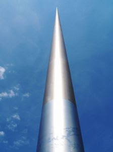 Slate magazine has a very good essay by Witold Rybczynski about a monument in Dublin. The article describes the qualities of the Spire and why something that is primarily an exercise in engineering has more impact that those monuments (read: world trade center memorial) that deal only obvious, staid symbolism. Rybczynski writes:
"What does the Dublin Spire mean? Whatever you want. There is no writing, no iconography, no overt symbolism. This spire is not a sign. St. Augustine said of signs that if you didn't know what an object was a sign of, it could teach you nothing, but if you did know, what more could you learn from it? That's why the most potent monuments—the Wailing Wall in Jerusalem, the Kaaba at Mecca, the Washington Monument—lend themselves to many interpretations."
The essay is accompanied with photos of the project: LINK
photo by bruno brunecky (sxc.hu)
(from Cartoon Brew)
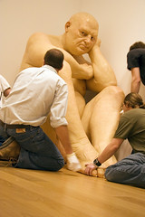
Ron Mueck Installation - "Untitled (Big Man)"
Originally uploaded by The Modern.
If you aren't familiar with Ron Mueck's work you should Google his name or click on the image to see the installation of some of his better known, more recent pieces. Mueck, an Australian artist who worked as an effects artists for tv and film, has created very hyperreal human forms that are out of scale (either very large or very small). The are amazingly well-crafted, so much so, that when assembled they give you pause.
I think this is a strangely captivating photo simply due to composition and cropping (as the photoblog's name implies).
There is something in underground Toyko. Could it be a secret city or just giant storm drains?
This video is essentially raw footage that betrays its quiet presentation. There is nothing graphic about this video but it is subtly disturbing nonetheless. The story unfolds quickly and while most of the video is a police spokesperson explaining the situation, she does little to bring closure or even fully explicate why the police did what they did.
Ran across this recently and thought it to be an effective visual display of presidential doublespeak. With all the useless dribble cut away we see the real meat of the speech. The simple revision makes apparent a certain desperation that I find pitiful. I guess the speech was meant to stir us up and scare us even, perhaps. It utterly fails to elicit those feelings. I think what I feel is tantamount to frustration even a little pity.
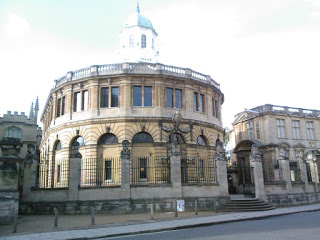
This is a crap picture of the Bodleian library at Oxford University in England. It is one of the oldest in Europe (the library not my picture - hah!) and is the main research library at the university. The architecture has made it a favorite of the film industry (parts of the first two Harry Potter movies were shot inside). It would've been fun to visit the library but my visit to Oxford was filled with other academicky (<-- my new word) things to do.
Jayme and I presented a paper at a visual literacy conference at Mansfield College early in July. I think we both enjoyed ourselves although Jayme was probably just being very polite as she usually is. We met lots of interesting, talented, and gentle people and gorged ourselves on pub food (not in front of them thankfully). I stayed on in England for the past month to visit family and experience British-style rain .
It rained - I am not joking - almost every single day! Needless to say, I am thrilled to be back stateside in our near 100 degree temperatures. I had plenty of time to read and think. Stay tuned.